 California prison overcrowding in 2006
The Challenge
Katherine Corn, Darien Satterfield and I (aka ‘Team Miss Demeanors’) won the CA 2020 Election Challenge this October, a campus-wide data science competition to visualize public data relevant to the upcoming state election. We chose to visualize legislation and prison overcrowding as it relates to Proposition 20 (which was voted down in November).
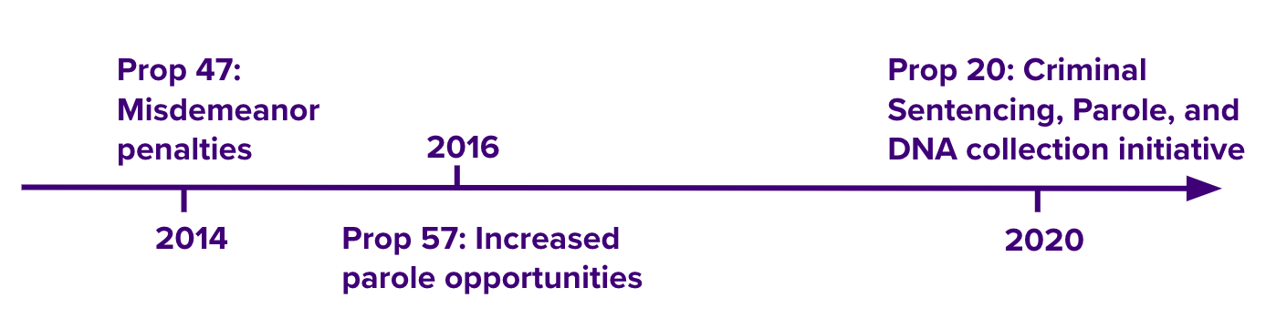
Prop 20
California’s prisons have a long history of overcrowding, so much so that the United States Supreme Court ruled in 2011 that overcrowded conditions violated California prisoners’ 8th amendment rights.
Proposition 20 would repeal parts of several recent sentencing reforms. Specifically, it would raise some misdemeanor theft charges to felonies and reduce parole opportunities.
We chose to analyze California’s prison populations through time to better understand the historical context for recent reforms and Prop 20 and the current status of prison overcrowding.
Questions
- What is the historical relationship between legislation and overcrowding in California’s prisons?
- Is there enough space in the California prison system to accommodate an increase in prisoners due to Prop 20 while staying under the Supreme Court mandated 137.5% capacity?
Data viz
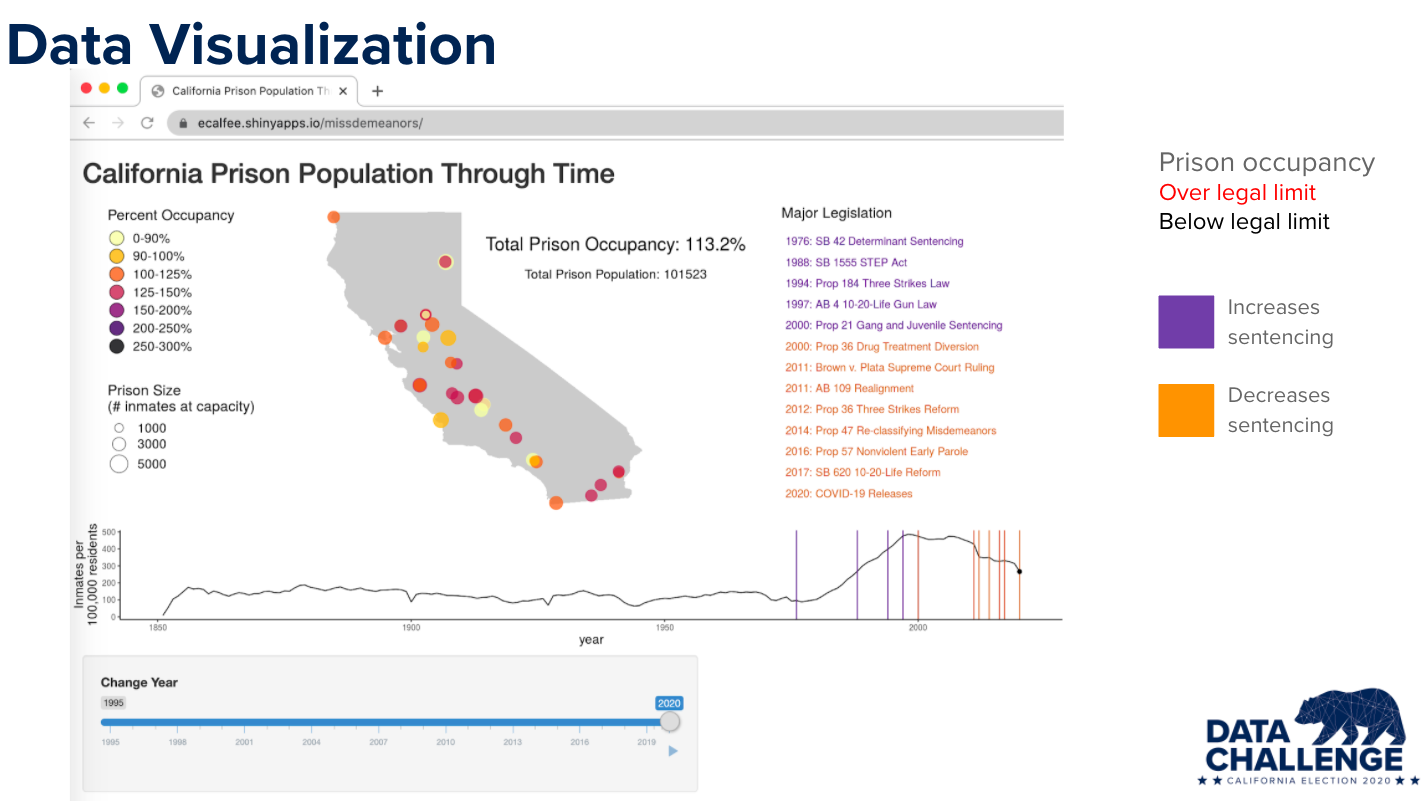
On a map of California, we plot each prison colored by it’s percent occupancy. We used R to geolocate prisons and scrape individual prison occupancy data from PDF reports published by the CA Dept. of Corrections and Rehabilitation. The image below is a screenshot of 2020, but you can toggle the year on the RShiny App to look at data for other years. At the peak of prison overcrowding in 2006, some prisons had over 250% occupancy, or 2.5 times the number of prisoners they were designed to house.
Below the map, we plot the number of prison inmates per 100,000 California residents. These numbers come from US Census and Finance population estimates and CA Dept. of Corrections and Rehabilitation prison population reports. These records go all the way back to the first CA prison in 1851. To provide some context for the change in prison population over time, we also plot major historical legislation and events. Events are colored purple if they increase prison populations and orange if they decrease prison populations.
 To interact with the RShiny app and see the map change through time, click
here.
To interact with the RShiny app and see the map change through time, click
here.
Conclusions
You can see that prison populations in California were relatively stable up until the 1960s and then rapidly rose along with legislation that increased and lengthened sentencing. Prison populations reached a peak in 2006. After a series of sentencing reforms, California’s prison populations dipped under the court-mandated limit of 137.5% of capacity (the most recent decline, in 2020, is from COVID-19 releases). However, even still, the prison system as a whole is at 113% capacity and this overcrowding is not evenly distributed. Some individual prisons are near 150% capacity, having one and a half times the number of inmates they were designed to hold.
Our figure indicates that Prop 20 has the power to reverse the course of criminal justice reform efforts, which have so far only partially solved overcrowding in California’s prisons.
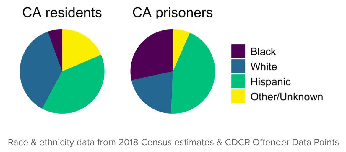
Overcrowding is a human rights issue and a racial justice issue. Because Black Californians are disproportionately sentenced to prison, overcrowding disproportionately harms these communities.
We present our project and talk more about our motivation and coding process in the webinar video found on the CA 2020 Election Challenge website (we’re about 30min in). All of the public data and code we used to create this visualization is available on our project github.